
About
British Heart Foundation redesigned bhf.org.uk in partnership with an external agency, Dept, who delivered new visual designs for the site. Those designs set the creative direction but weren't structured to build from, govern, or scale — reconciling them with BHF's needs and turning them into a working system fell to the in-house UX team.
Scope
Audit the existing site, then define a new design system from the ground up across four tiers — Foundations, Components, Component Templates and Page Templates — and produce page templates with rules clear enough that the Content team could build campaigns, category pages and more without a designer involved in every page.
The problem
An outdated system
BHF's existing design system no longer reflected the site's needs, and hadn't been built with a mobile-first web in mind.
A handoff, not a system
Dept's designs were visually resolved but carried no components, no rules and no governance — nothing a team could build or maintain from.
Snowflakes
Without a system to draw on, the Content team was building its own one-off components to ship Campaigns and other pages, fragmenting the experience page by page.
What we wanted to achieve
- A unified experience across bhf.org.uk, in place of a site accumulating inconsistency page by page.
- A new design system with genuinely reusable components, not another set of one-off screens.
- Page templates with rules clear enough that the Content team could work quickly and consistently.
- Closer, more structured collaboration between UX, CRO, Content and Development — one shared language across all four.
My role
- Audit
- Ran the full audit of the existing site alongside the UX team, cataloguing where the old system had fallen behind and where the Content team's workarounds had already started fragmenting the experience.
- Definition
- Helped translate the audit findings and Dept's design direction into a four-tier architecture — Foundations, Components, Component Templates, Page Templates — with mobile-first and component reusability set as non-negotiable principles from the start.
- Design
- Co-led the build of the system itself: component architecture, patterns and developer documentation, checked against accessibility standards throughout. I personally designed and built out page templates and component templates, including the Campaign Pages Template and the donation widget featured below.
- Governance
- Built and maintained the contribution model — the decision framework that routes every new design request to reuse, assemble, update, or build from scratch — and kept it current myself as real requests came in.
The system: four tiers, one foundation
Rather than a loose component library, the system was built as a strict hierarchy — each tier built only from what the tier below it allowed, so a single change to a colour token could ripple safely all the way up to a live campaign page.
- 01 · Foundations
Foundations
The shared rules everything inherits: colour, type, spacing, grids, icons — structured as tokens, not fixed values.
- 02 · Components
Components
The atomic pieces: buttons, cards, avatars, pagination — and the full form library.
- 03 · Templates
Component Templates
Components assembled into reusable patterns with their own rules: accordions, hero banners, the donation widget.
- 04 · Templates
Page Templates
Full page layouts with content rules attached. Fifteen shipped by the time I left — including Campaigns.
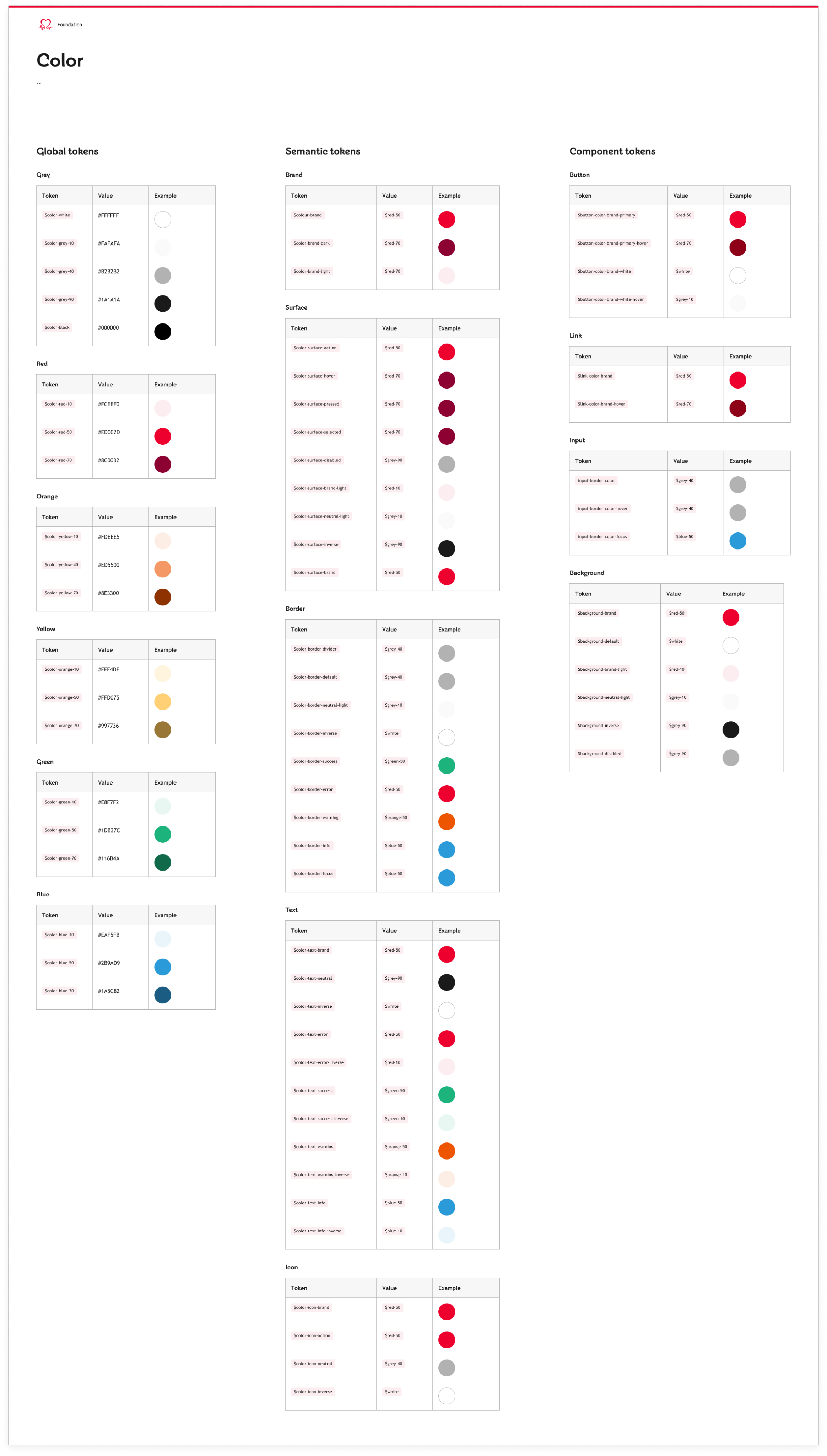
Foundations were built as a three-layer token model rather than raw values: global tokens hold the actual values, semantic tokens give them meaning, and component tokens apply them to a specific use. Change the brand red once at the global layer, and every button, link and background that depends on it updates with it.
Foundations, in practice
The colour foundation alone runs to three tables — global, semantic and component tokens — each documented with its token name, its value, and a live example, so a developer never has to guess which layer a colour belongs to.
Components, in practice
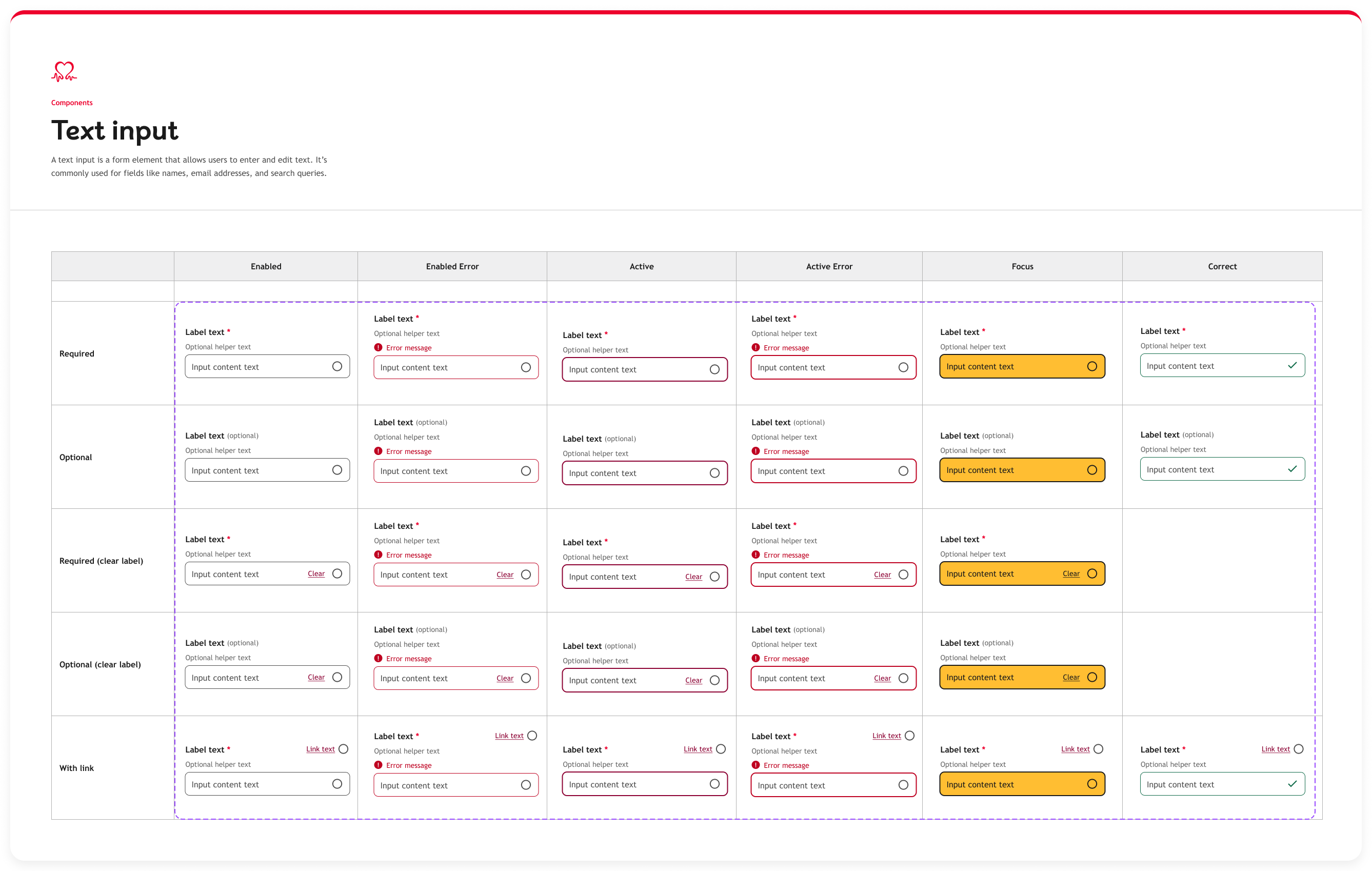
One tier up from Foundations, Components are the atomic pieces built from those tokens: buttons, chips, cards, avatars, pagination, and the full form library. The text input shows how far that documentation went. Rather than one field with a few notes attached, it was specified as a full matrix — every state a user can put it in, against every configuration a form might need — so nobody building a form had to invent a state the system hadn't already decided.
What the matrix decides in advance
Errors never rely on colour
Both error states add an icon and a written message above the field, not just a red border — the Foundations rule that colour alone never carries meaning, applied at component level.
Focus you can't miss
Focus switches to a solid yellow fill with a heavy dark outline: unmistakable for keyboard users, and deliberately distinct from the brand red that signals an error.
Required vs. optional, in words
Required fields carry an asterisk; optional ones say “(optional)” outright. Helper text sits between label and field, so guidance is read before typing, not after an error.
The matrix is also what made the component safe to reuse. Its error and success borders draw on the semantic tokens from Foundations — $color-border-error, $color-border-success — not values picked by eye, and its states were settled once, here, rather than re-decided inside every form. Chips, buttons and the rest of the form library were documented to the same depth, which is what let the next tier assemble them into larger patterns without reopening any of it.
Component Templates, in practice
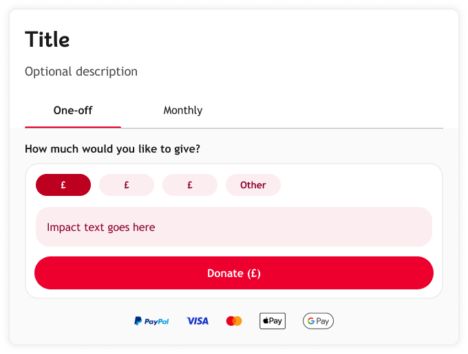
One tier up again: Component Templates assemble several components into a reusable, governed pattern. The donation widget is the clearest example — built entirely from the form components above (chips, text input, button), assembled with its own rules and documented as a matrix of states: tabbed vs. untabbed amount selection, crossed with suggested-amount vs. impact-messaging content, across desktop and mobile, one-off and monthly giving — sixteen governed states from one template.
Deep divePage Templates — the Campaign Pages Template
Campaigns is one of fifteen page templates, and the one I want to walk through in detail — it's where the system's hardest problem shows up most clearly: giving the Content team real flexibility without letting a new campaign turn into another snowflake.
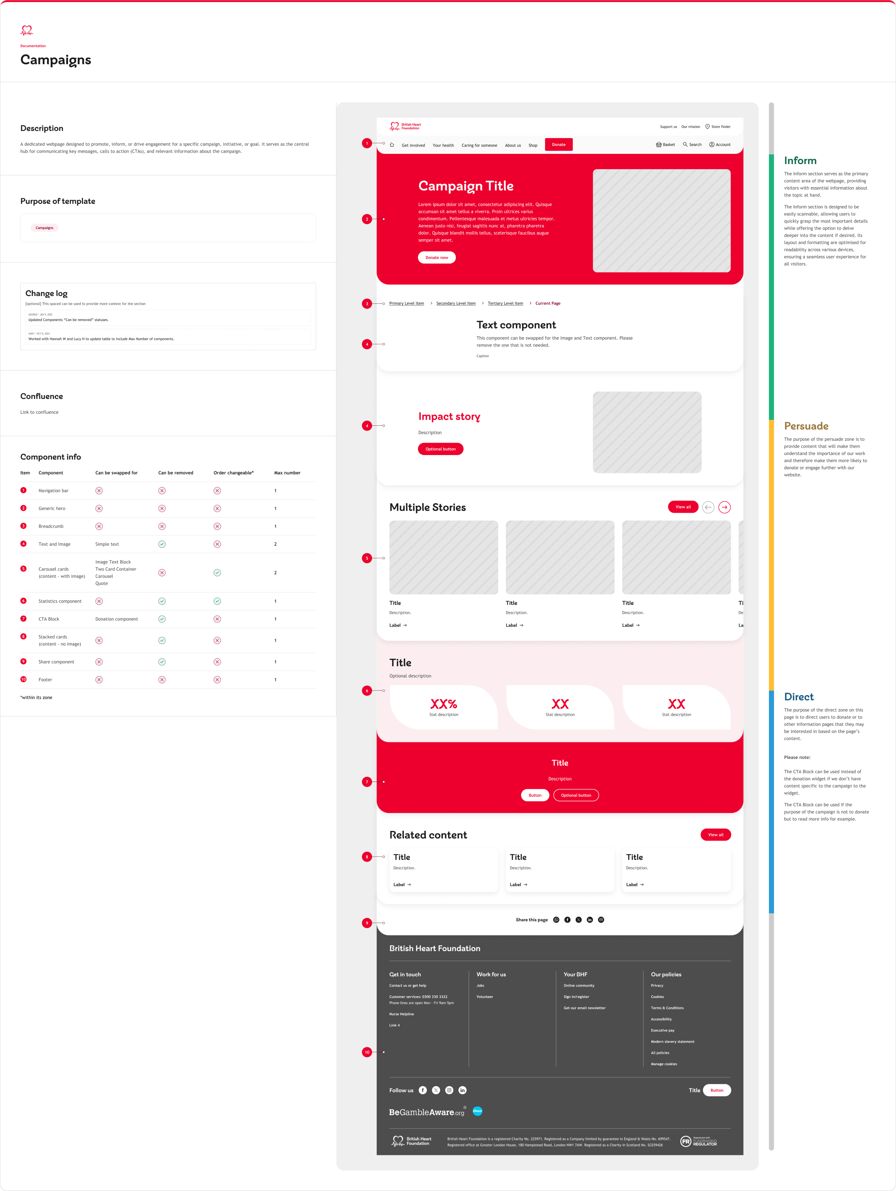
Every section of the page is assigned to one of three content zones, each with a defined job:
Inform
The primary content area. Scannable, with the option to go deeper.
Persuade
Content that builds the case for BHF's work.
Direct
Directs the visitor to donate, or to further information.
What the rules actually say
Every component on the page is governed individually — whether it can be swapped, removed, reordered, or capped at a maximum count. The full rules for the template:
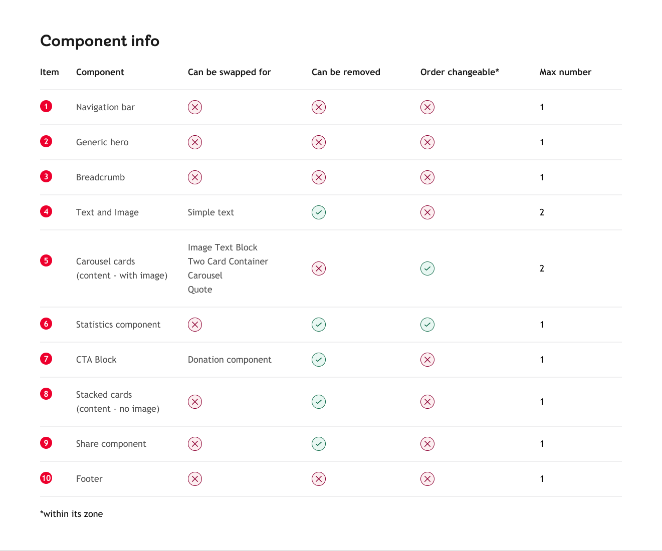
The pattern behind the table: the further a component sits from BHF's brand identity, the less room it has to move. The further it sits toward content, the more freedom the Content team has, because the risk of a bad decision there is lower.
The system didn’t stop evolving at handover. Its own change log records me updating the “can be removed” rules on 9 January 2025, and a Content Design colleague logging an earlier update, made with two other teammates, that added maximum component counts.
GovernanceThe contribution model
“BHF has a contribution model that allows product teams to add new features based on their product requirements. This model also ensures that the quality and consistency of the user experience are maintained.”
Every request runs through the same four questions: does the library already meet the need? If not, can an existing component be assembled or updated to meet it? Only if the answer is no all the way down does a team get to build something new.
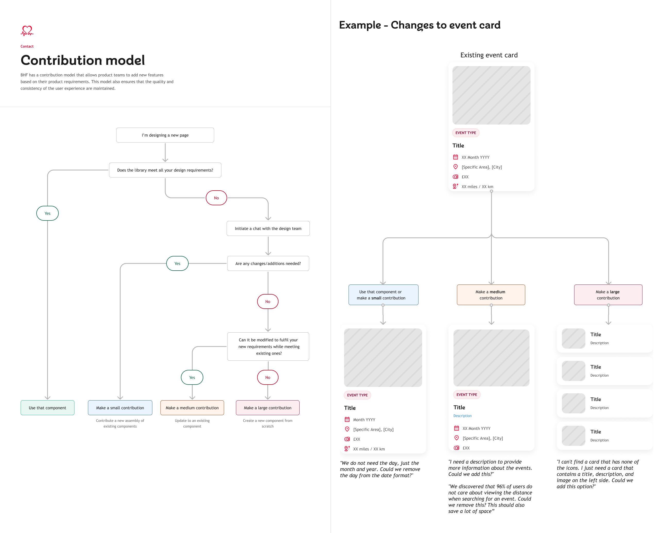
The model was tested against a real example — a request to change the event card — and the actual stakeholder language behind each outcome:
We do not need the day, just the month and year. Could we remove the day from the date format?
→ small contribution
We discovered that 96% of users do not care about viewing the distance when searching for an event. Could we remove this?
→ medium contribution, backed by research
I can't find a card that has none of the icons — I just need a card with a title, description and image. Could we add this option?
→ large contribution
Accessibility
Accessibility rules were written into the Foundations layer rather than treated as a final check: colour contrast requirements strict enough to flag anywhere colour alone was used to convey meaning; left-aligned, never-justified text; no all-caps or underlined body copy; and typography rules that adapt across breakpoints rather than just shrinking. Colleagues who continued the programme after I left credit that foundation with helping lift BHF’s Silktide accessibility ranking from 79th to 23rd, embedding WCAG standards directly into the organisation’s digital products.
Outcomes & reflection
By the time I left BHF, the system supported fifteen page templates from one shared set of foundations, a component library documented deeply enough that Content, CRO and Development could all build from it independently, and a contribution model that kept working after launch — evidenced by its own change log rather than my say-so. Former colleagues who kept working with the system after I left also point to concrete gains: consolidating overlapping variants cut the total component variant count by roughly half, and the shift to design tokens reduced manual rework for design while speeding up how quickly the Content team could apply components to their own pages.
What I'd tighten with more time: the donation widget's sixteen-state matrix was fully documented but never had adoption data attached to it — the next iteration of this system deserves usage tracking baked in from day one, not audited in after the fact.